Feedback (4.5b36)

Hey guys and girls!
Just a few things...
I have found a couple of minor things which could be tweaked to make the app even better, (as usual, there are BARELY any improvements because the app is pure perfection...) but here are some I caught with my MASSIVE eye:
1) When in the beta browser (iPhone 4S) and you use the key logo to log into the website, it does not show the website logo on the login, it shows the standard 'key hole'. It would be great if it could show the logo associated with the login for the final finishing touches...
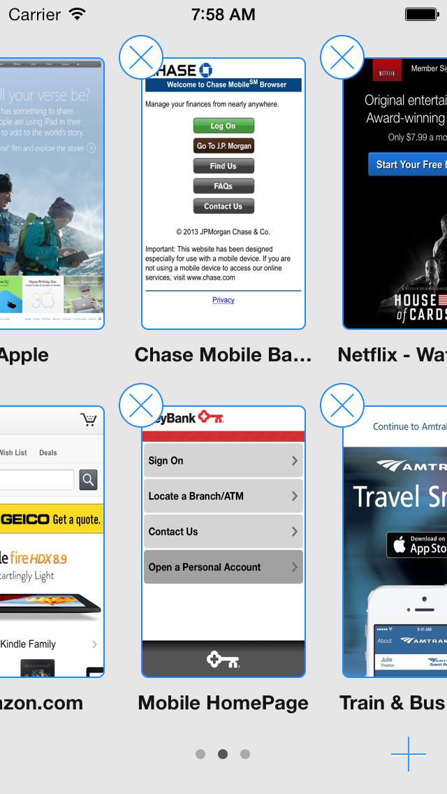
2) On the iPhone 4S, when you go to the tab selection page on the beta browser, and you have two tabs open, the 'X' Mark on the first page (to close it) is difficult to operate as it is far too close to the main task bar (where the time and signal are on the iPhone).
3) When I first started up the app (for the first ever time) I had a bit if trouble connecting to my dropbox account... It may just be me and my ridiculously sluggish internet connection (BT for you), but you could just show the name on the Dropbox account instead of 'Account ABCXYZ123'.
4) When in the beta app, there is no animation of the settings icon to show that 1Password is syncing with dropbox (or syncing at all for that matter!). I just thought it was a fantastic touch in the official 1PW app that you had the settings animation move when the app was syncing.
5) When the lock screen appears, (when I open the app) the 1PW logo is a little 'off-centred'. (Sorry, I'm just to paranoid!)
Thanks for all your great functions and features! (You LITERALLY saved my life when my old passwords were hacked!)
Jacob Hill ;-)
P.S. I LOVE 1PASSWORD! :x
Comments
-
Forgot to mention, the text in the tab page (browser on the iOS beta) conflicts with the background of the bit it's on...) << I'm not too sure that made any sense whatsoever..... :-)
0 -
Hi, @Jacob_Hill, thanks for the kind words and all the great feedback. It made perfect sense. =)
The bit about the text in the tab browser will be fixed. The tab browser is still incomplete. I saw a sneak peek of what our devs have going on with that, and I think you'll be pleased with the result. Stay tuned for improvements in upcoming betas.
The site-specific icon in 1Browser's item list is an interesting idea. I've passed the suggestion along to our developers for their consideration.
Thanks for letting us know you find it a bit difficult to hit the X to close the first tab. I think this problem will be resolved when the tab browser is completed.
The sync UI is still incomplete, so things like a progress indicator and such are yet to come. Programmatically speaking, I'm not 100% certain about prettifying the Dropbox account display, but I know that if we can make it more user-friendly, we definitely will.
Thanks again, Jacob. Glad to hear you're enjoying the beta. =)
0 -
Thank You @Nik !
0 -
Mr. @Jacob_Hill! Thanks for all your great feedback, you rock! We will be putting out a new beta today that should fix a few of the little paper cuts that you've been describing. In particular we did clean up the web snapshot view on the iPhone:

Cheers!
best,
Michael Fey
mrrooni@agilebits.com
AgileBits0 -
@MrRooni, that looks hot. Thanks for sharing!
0


