1Browser Improvements
The Mac version is perfect as I can login directly through Safari but on iOS I am forced to use the 1Browser through the app if I want my login information automatically filled it. That is great and all but in its current state the 1Browser simply isn't good enough to be used for everyday browsing. Its definitely not ready to be your primary browser. The thing that annoys me the most with the 1Browser is its clunky. There is too much chrome in the way. There are bars at the top and bottom and leave very little space for actually browsing. There is also way to many buttons on the navigation bars. Keep it simple. I shouldn't have to hunt for a certain button and it shouldn't be there unless I want it. Take after safari and hide the navigation bars while I'm scrolling. All I want is more space to view the website.
Comments
-
Hi Derrick,
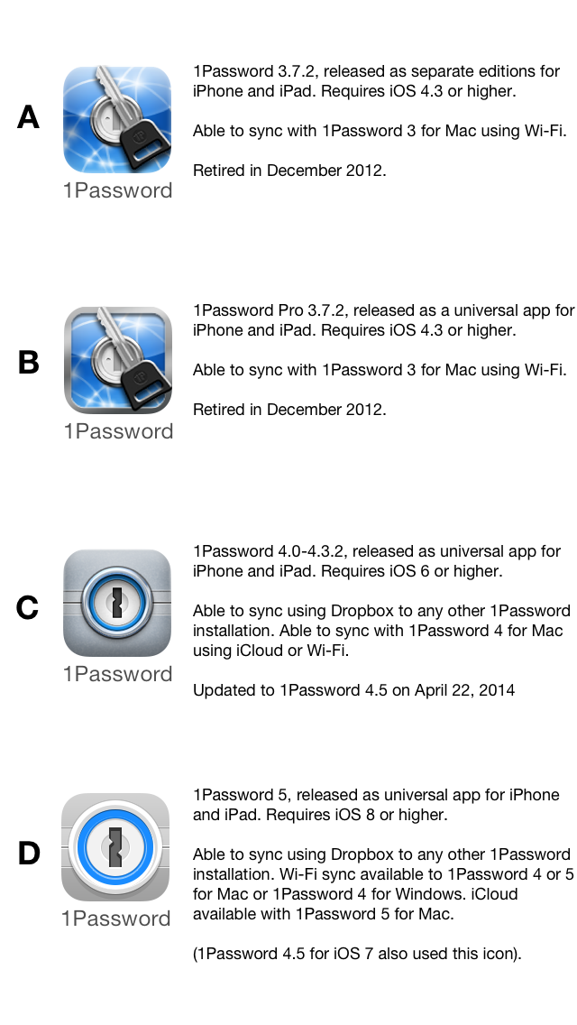
Thanks so much for providing your thoughts on 1Browser. Could you please let me know what version of 1Password for iOS you are currently using? To find out which versions you have, let me know which icon you see on your home screen from the following image: A, B, C or D?
 0
0 -
I have version D (4.5.3)
0 -
Hi Derrick,
Thanks for confirming that for me! I'm happy to pass your thoughts along to our developers. :)
0 -
There probably isn't too much point at this stage to concentrate much on 1Browser development. As I understand it with the release of iOS 8 1Password will be able to hand off your passwords to Safari. It might work with any browser, I just don't have a clue if the browser has to written to support the hand off (but you can bet Safari will).
So look forward to iOS 8, Derrick.
0 -
Hi @steve23094,
We're all looking forward to iOS 8 here too! :)
0
