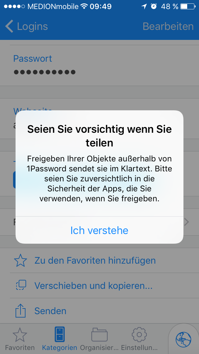
1Password Improvements
Hey there!
I noticed two small things that could be improved in 1Password:
- The arrow in the "Share" icon is abit too long. In iOS, it begins in the middle of the square (I'm a little bit ashamed of noticing this.).
- After tapping the "Share" button, an alert appears. In German, the message sounds a bit weird. This message may be better: "Seien Sie beim Teilen vorsichtig" (title), "Außerhalb von 1Password werden Ihre Objekte im Klartext gesendet. Achten Sie deshalb auf die Vertrauenswürdigkeit der Apps, die Sie zum Teilen verwenden." (message).


Comments
-
@JohJakob: I can't guarantee that we'll change the icon, but you make an interesting point. I suspect I will not be able to un-see that now! :lol:
Not knowing German really at all I can't comment one way or the other on your wording suggestion, but I'll bring this up with our resident German to see what he thinks. But I did also want to mention that you can also contribute to 1Password translations more directly if you like:
1Password for iOS and OS X (Crowdin)
Thanks for the feedback! :)
0 -
Likewise, thanks for bringing these issues up! :chuffed:
0 -
Hi @JohJakob,
Danke für die Anregungen. Ich habe die Formulierungen überprüft und verbessert.
Grüße aus Trier,
Alex
0 -
Hallo Alex!
Das ging aber schnell. Vielen Dank!
0 -
Gern! :chuffed:
0


