Slow animation
Is there a way to turn off the animation for the Safari plugin? If not, there needs to be a way to revert its behavior back to the previous behavior. The animation, while nice to look at, makes submitting my forms extremely slow, especially on pages that load flash or animation already. For example, it takes about 10 seconds or more for me to login to Capital One's website whereas in the past, it was pretty quick. The same is happening on my company email page, and other locations.
Comments
-
Please let me know the exact URL of the login page(s) where you are seeing slow animation. I've seen a couple instances where it is slow, but I can't reproduce using my Capital One Login. Here is the URL I am using:
https://servicing.capitalone.com/c1/Login.aspx
Please let me know. Thanks!
0 -
On the servicing page that you have outlined above (for the credit card login), it loads about what I would consider to be normal with the animations (even though still slightly slow IMO). However, the most noticeable that I have is on the main Capital One page (http://www.capitalone.com). That is where I normally login because in addition to Capital One credit cards, I also have a Capital One bank account which is logged in through the main URL (you can also login to credit cards from that page as well). On that page, you'll notice that it fills in the username field first, then it waits several seconds (about 10 on my computer), and then fills in the password field. I have tried both when the form is available to be filled and submitted and after waiting several seconds after the page finishes loading.
0 -
We came across that not long after I posted my reply above. It definitely needs to be resolved and is on our radar. Thank you for your feedback!
RM4378
0 -
Until then, is there a way to turn it off? Personally, I prefer to not have the animation at all, which is really what I would like to have going forward.
0 -
Overall, I don't like the animation. It's too slow and makes the user feel as if it's taking too long to fill the form. I have a habit of pressing Command + \ and then immediately hitting return. I always am able to hit return before the form is finished being filled out and I end up with login error.
This animation thing is a total stepback. Please give users the option to REMOVE this animation. For power users who are used to speed, this animation not only visually slows things down, it actually makes us unable to login if we hit the return key before the animation is finished filing in the form. Logging on the Gmail is one example where this is a problem.
0 -
I completely agree. The animation is awful. Slow and sometimes it buggs the text box, moving the text down a bit.
Please give us the ability to turn it of.
Productivity >>> Beauty
0 -
Yes, please please give us the option to turn it off. Command - \ + return is no longer usable, you have to wait for the animation to finish. And no, turning on "automatically submit" is not a good alternative, I have to be able to check or uncheck any checkboxes before submitting my password.
0 -
Another request for the option to disable animation.
0 -
YES! Please turn off that horrid animation. It makes signing in to pages much slower, especially for some that have 4 or 5 fields. Watching it is almost comical.
0 -
Rather than continuing to complain on Twitter about the new browser extension, I thought I'd try to be a little more constructive and post here about what exactly I don't like, and why.
The first and biggest issue is it's slower than before. With the old (e.g. last week's) extension, when I hit Cmd+\, the fields are instantly filled in and the form submits. With the new extension, first the username fills in and animates normal -> larger -> normal, then the password fills in and animates normal -> larger -> normal, and then finally the form submits. I can watch it all happening before my form actually submits. Granted it's probably only a second or so, but 20 times a day it gets annoying. (where by annoying, I mean 1P has literally gone from being software that I love and never think about, to something that grabs my attention and actively annoys me like 20 times a day).
My suggestion on this one would be either a) let me turn off these animations, or if that's not going to happen, then b) at least fill username and password in at the same time, which would cut down the perceived delay.
I'd also suggest making the animations faster - anything to cut down on the wait time is a good thing in my book.
And second, It messes up some forms. For example, go to mail.google.com, turn off autosubmit, and Cmd+. The text for the username and password gets a little wonky - it seems to shift down in the box. Tabbing around fixes it, but it has a feel of being broken.
This one leads to a larger point - it seems a little over-reaching for 1P to actually go in and modify the CSS for a page (assuming this is how it's working). Scanning a page and filling in a form is great - but actually modifying the form? That feels uncomfortable. If something gets broken somehow, suddenly I have to wonder if it was broken before 1P changed it, or if 1P caused some strange side effect.
Anyway, hope this feedback finds its way to the right folks. I love 1P, but this update has been quit jarring for me.
0 -
Yay! I'm glad I'm not the only one who is expressing these views! I hope more of us join in so that Agile Bits hears loud and clear that many of us don't like this feature.
If they really want to do animation of some kind, one way is to have all fields that are filled by 1Password "flash" (or expand) at once instead of field by field. Or, actually, better get rid of it. :) I mean, was anyone complaining that we're not sure what fields 1Password was filling out and needed it to indicate this by animation?
0 -
Thanks for the feedback, folks! I've passed this along to the developers and will post back here with more information as it becomes available. Your patience is appreciated. I'm advocating on behalf of all of you. :)
0 -
Thanks. Please let them know that this is now a critical issue that needs to be resolved ASAP as this stupid animation thing nearly cost me $2000 yesterday. I went to check in for a flight (I travel quite a bit) and went to prepay for my baggage fee. Whatever is doing the animations took the form and modified it such that when it filled in the credit card information, it also changed the number of submitted bags from 1 to 15. Fortunately, the airline had a prompt that asked "are you sure you want to submit 15 bags" before it actually charged me. This was not the behavior last week before the change and nothing changed on the airlines website between now and then. I have since disabled the auto-submit feature that I had on to prevent this from happening again in the future, but this needs to be resolved. Yes, the animations are "pretty," but for power users like me who use 1Password constantly throughout the day, it just doesn't work.
0 -
I won't say that the animation is absolutely awful, because it's subjective and I'm sure there's plenty of people who like it. But I don't. This is another vote for a setting that allows me to disable it.
90% of the forms the plug-in is filling out for me have two fields (username and password). I don't really need a visual cue to show me what it's doing. Even when there's more than two fields, it's still not a "where's Waldo" situation for me.
0 -
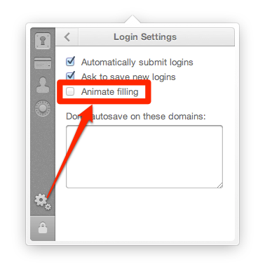
It is an option the the last extension beta : Version 3.9.11.BETA-2 (build #391102) - Released on 2013-03-29
in th extension menu ( the gear) Logins settings
0 -
d
0 -
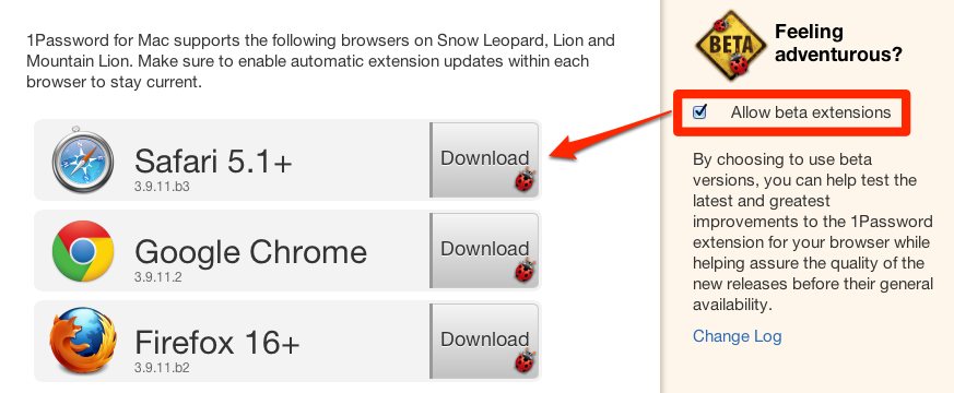
We just released an update to the beta channel of the 1Password Safari extension that includes an "Animate filling" option (Settings > Logins).

You can switch to the beta channel of the 1Password extension by checking the box to "Allow beta extensions" on the extension installation page.

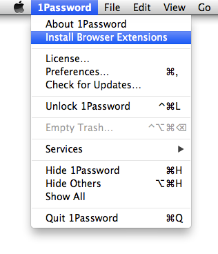
You can get to the extension installation page by selecting "Install Browser Extensions" from 1Password's application menu.

I hope that helps. Please let me know.
0 -
I'm going to close this thread as resolved now, but please create a new thread if you are having any trouble with the setting itself, the animation, or anything else. There is always room for improvement, and we really appreciate your feedback! If you just want to disable the animation and be done with it, you can now do so. But if you want to continue to help us improve 1Password, we will continue to be grateful. :)
Thanks so much!
0
