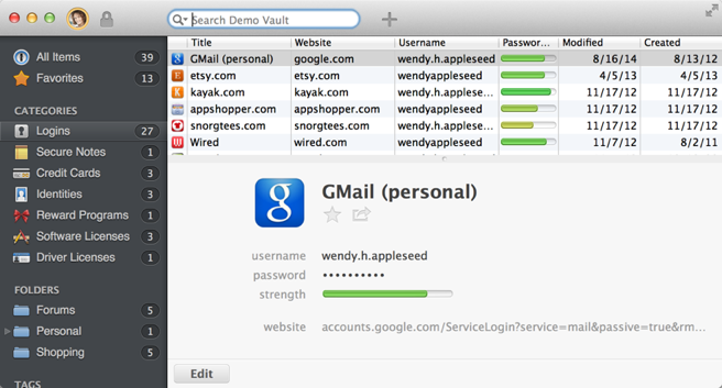
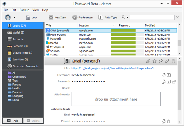
User interface

Hi, I'm a long-time and very happy user of the Mac and iOS version of 1Password.
I had been singing the praises of 1Password 4 to a Windows user friend of mine and she eventually decided to buy the Windows version. As I helped her set it up though, I started to feel embarrassed at how how convoluted and unappealing the UI is compared to the Mac version even though it provides basically the same functionality. I'm aware of the concept of being a "good OS citizen" and trying to match the look and feel that the OS's users are familiar with. However 1Password 4 looks and feels like it was built by following Windows XP-era design guidelines to the letter (if there even was such a thing).
I could provide more specifics if you want, but Im sure you have people much more qualified than me on the topic. I know 1Password 4 provides fantastic value in terms of functionality, and the app and its users deserve a better UI.
You guys do amazing work, I’m just hoping over time the Windows version will acquire more of the Mac version's design qualities.
Comments
-
Hi @fdlbt,
Thank you so much for the feedback! Yes, the UI in the Windows version is certainly different from the Mac version. Some of that is due to OS differences of course, but I'm sure there's more we can do improve the look & feel of 1Password 4 for Windows. In fact, I'm sure this is something on our developers' "to do" list, but the basic functionality of the software was a bigger priority for the release this summer.
We definitely appreciate the feedback about that! :)
0 -
I have to say, compared to the Mac, it isn't great.

Some of that is Windows vs Mac standard UI, but the client area is less polished. The left button bar particularly imo. I think it's been requested before but, a three column layout option like the Mac would be nice too.
0 -
Oo, interesting. I've never even seen a screenshot of that grid mode in the Mac version. Is that the default, and if not, do you have any metrics on how many people use each mode?
Something else I just noticed comparing the two, the Windows version has a lot of dead space at the top. This is because the Mac version has coalesced its toolbar in the window NC area. Chrome shows that this is certainly possible, although granted, it is definitely not standard Windows behaviour.
0 -
I'm not aware of any metrics regarding the choice of layout (or any way of collecting them, for that matter, since it's just a command on the View menu).
There is no perfect balance between "looking like 1Password" and "looking like Windows"; we do try, but we know we'll never make everyone happy with the result. :)
0 -
I am also disappointed with the new user interface. Among the disappointing features (Version 3 to Version 4; Windows) are the loss of the different font usage of Version 3 to distinguish between password letters and numbers, the more washed out (and less contrasting) password signal strength indicators, the use of a new super-tiny font size to present information, and the use of non-intuitive icons (a "padlock" does not suggest "reveal password" to me).
0 -
and the use of non-intuitive icons (a "padlock" does not suggest "reveal password" to me)
That's fixed in the beta version. Closed Padlock icon means hide password and the open padlock icon means reveal it.
0 -
In fact, you're neither locking nor unlocking a password when you click on the icon next to it in the details area, so a padlock just doesn't make sense to me, either.
I've expressed my preference for an "eye" icon to indicate that it's controlling whether an obscured password can be seen.
0 -
the use of a new super-tiny font size to present information
The Windows OS controls the font size. You can change this in your Windows Control Panel.
0 -
I've expressed my preference for an "eye" icon to indicate that it's controlling whether an obscured password can be seen.
I like that.
0 -
I definitely support the idea of an eye icon.
0 -
Thanks for the feedback, @RichardPayne and @J.M—I've forwarded your comments to the design team.
0 -
@fdlbt Out of curiosity, what is so bad about this?
Sorry for not replying sooner!
In no particular order:
- Here's what it looks like to generate a new password for an existing item on the Windows version:

"I'm clicking the OK button but it just goes ding, ding, ding...".
The same process on the Mac version looks like this:

Adding a new "section" with new fields is equally convoluted and full of pop-up windows on the Windows version and equally simple on the Mac version. Editing data "in-line" is the most straightforward metaphor and what novice users are used to seeing everywhere these days. I may be out of touch with the Windows world since switching to the Mac four years ago, but I doubt that many Windows users would come to you saying they prefer pop-up windows over editing in-line.
I'm aware that the Mac version has the "list on top" as an option but I would argue that the default "list on the left" layout is much better for most people and should at least be an option on Windows, and probably the default one. The larger "list on the left" items makes it much easier to read and allows for the right pane to display more information about the selected item without having to scroll the contents as much.
The browser extension and main 1Password window should unlock / lock one another.
The browser extension should behave as on the Mac version, i.e. open directly into the live search field with auto-highlighted top result, keyboard shortcuts etc.
I support the "eye" icon to reveal passwords.
The next two are arguably power-user requests, but just seem too fundamental to be omitted:
While typing in the search field, the top result should automatically be selected and its contents shown in the bottom pane. Which leads to...
There should be keyboard shortcuts for basic things like Edit, Save and Delete.
Lastly, and this could be a bug but the Windows version only displays a small number of the login icons that were automatically saved into items created using the Mac version. Maybe icons are not synced for some reason, but if that's the case why not have the app automatically download them when a new vault is added? And sure, it's just icons, but they play a role in the overall look and feel of 1Password and really should be displayed if they exist somewhere.
It's a combination of many things, some of which I haven't mentioned above, but the Windows version just has a look and feel that reminds me more of an MS Office app than something that's supposed to make user's online lives more simple and safe. On the other hand, the Mac version is a great example of how a powerful and deep app can be made user-friendly and even fun to use, while still providing power users access to all the nitty-gritty details under the hood.
Anyway, you guys are awesome just for paying attention to user comments like these. I'm not a developer or a designer, but I'm well aware that great software requires perpetual change and iteration, so here's to hoping that some of this resonates with you and helps you get even more happy user on the Windows side!
0 -
+1 to all of that @fdlbt
The browser extension and main 1Password window should unlock / lock one another.
They do, with one exception. The operate on a push model, not a pull one. When the app or the helper starts, they start locked. They can not pull the lock state from the other but when you perform a lock/unlock operation on either, the new state is pushed to the other if it is running. Have a search back through the forum if you want the gory details. It's been discussed at length.
Lastly, and this could be a bug but the Windows version only displays a small number of the login icons that were automatically saved into items created using the Mac version. Maybe icons are not synced for some reason, but if that's the case why not have the app automatically download them when a new vault is added? And sure, it's just icons, but they play a role in the overall look and feel of 1Password and really should be displayed if they exist somewhere.
I believe that they don't sync the icons for bandwidth reasons and that they don't automatically download the icons for privacy reasons. Downloading rich icons effectively gives a third party a complete list of all the sites you're registered on. This should be a user choice, not an automatic action. The Android version was doing this automatically at one point and you should have heard the wailing and gnashing of teeth. ;)
This is because the Mac version has coalesced its toolbar in the window NC area. Chrome shows that this is certainly possible, although granted, it is definitely not standard Windows behaviour.
@svondutch
I just had a thought. Something that is very common in Windows apps now is to hide the menu until Alt is pressed, or use an Android style overflow menu on the toolbar. Just a thought.0 -
+1 , The UI looks really old. I love the OSX design, rounded edges, 1P Mini etc. Would love to see the same design in Windows...
Maybe in Windows 10? :)
0 -
I am using the trial version at this point, deciding whether to make the switch from LastPass and have some of the same thoughts. It makes it appear that the Windows version does not get the attention the Mac app gets, which is concerning from a new user's perspective. If this is the case, at least make the Windows app cost less than the Mac app!
One question: Is there any plan to add a "tags" section to the left sidebar? The tags function is pretty useless in the Windows version.
0 -
One question: Is there any plan to add a "tags" section to the left sidebar? The tags function is pretty useless in the Windows version.
While I disagree that tags are useless in 1Password for Windows, the addition of a Tags group to the sidebar is, indeed, planned for a future release. Here's some related information from Working with folders and tags in the 1Password 4 for Windows user's guide:
Each item can be associated with as many tags as you like.
... Add and remove tags as you edit individual items. Search for tagged items by typing the tag name (or by pressing Alt+↓ and selecting the tag name) in the search field.
In the browser extensions, just start typing to filter the list to show Logins with matching ... tag.
0 -
back to user interface - are you planning to change something in the near future?
0


