Improving UI?
Hello,
I was wondering if you are going to improve the UI of 1Password? It currently looks a bit basic, like a HTML5 app. It would be better to look a bit more native.
Also the browser extension can use a redesign. (I know that this has to be HTML5)
I remember the macOS applications to be nicer, more in style of the Apple OS.
Thanks
1Password Version: Not Provided
Extension Version: Not Provided
OS Version: Windows 10
Sync Type: Not Provided
Comments
-
@Qarizma: The 1Password 6 Windows desktop app is 100% native, but you're right: it doesn't look like an old-school Win32 app. It works on Windows 7 and 8.1 as well, but given that Windows 10 is the future we're using Microsoft's latest tools to built it and taking cues from their latest designs as well. I appreciate that everyone will have different taste, as the "look and feel" of software is pretty subjective, but could you be more specific about what you're looking for us to "improve" and "redesign" as we refine things going forward? I can't promise we'll implement your specific requests, but we'd love any suggestions you can offer...and the chance of us guessing what you want are pretty slim. Thanks in advance! :)
0 -
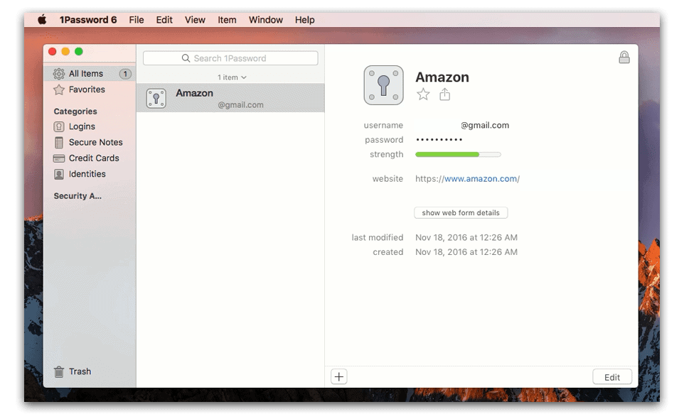
@brenty Thankyou for your reply. Just compare the design of the Windows app and the macOS app. The macOS is very clean and native looking (it's using the Apple design language for macOS).
macOS

Windows

Take a look below at Settings in Windows 10. (the successor of the old Configuration screen) It's native and looking more like Windows 10 native.
 0
0 -
@Qarizma: As you can imagine, I see these regularly. ;)
It seems like what you're saying is that they don't look the same. I don't think they have to. You describe 1Password for Mac as "clean" and "native looking". Can you be more specific about what you want? That sounds like you want 1Password for Windows too look more like 1Password for Mac. But then you compare it to Windows 10 Settings, which is a step in the other direction. Our new Windows app is sort of an in-between point between the two I think. I'm not sure it strikes exactly the right balance, and that's fine because we're continuing to iterate on it with every release. But I'm still not sure exactly what you feel needs to be changed there. Again, we're open to feedback, but it's unlikely that we'll be changing the app in ways you would like us to unless you at least tell us what they are. :blush:
0